This week at Go Greena HQ we have been busily scouring the web for graphics, illustrations, diagrams and infographics that put green issues and energy saving into perspective. Below are seven of our favourites:
Top 10 UK Solar Cities

Residents of Plymouth can give themselves a big pat on the back according to this infographic from dailystatistic.com — they are the biggest solar electricity users in the UK! Unsurprisingly, the biggest solar towns are all in the south, with the majority along the south coast, and Swansea being the furthest north. Still, it’s proof that even rainy old Britain is still sunny enough for solar power to work.
If your roof faces south (or south-ish) it will be ideal for a PV Solar Panel system. Take a look at our solar panels page to see how much money you could make.
Solar Power in Europe

How does the UK compare to the rest of Europe in terms of adopting solar power? This infographic from Power & Energy has the answers. As you might imagine, Mediterranean countries like Spain, Greece and Turkey are all doing well, but they’re still way behind Germany who are one the top photovoltaic installers in the world.
Despite our northern location, the UK is still beating nearby countries like France, Belgium and Ireland. According to this, our solar output saves the equivalent of 46,000 tonnes of oil a year. Not too shabby!
The Evolution of Solar Technology

Staying on the subject of solar power, we spotted this handy diagram on extremetech.com. Going back as far as 1839, it describes how the photovoltaic effect was first discovered and how the technology has progressed over the decades. Did you know for example that US president Jimmy Carter had solar panels installed on the White House in 1977?
The American Energy Spectrum (Interactive)

View the interactive infographic here. Note that this uses Flash player and may not display on some mobile devices.
From good.is comes this interactive graphic illustrating American energy usage. Like most industrial countries, it’s dominated by coal, oil and gas, which account for over three quarters of total energy consumption. But on the flip-side to this, 8.1% of energy generated comes from renewable sources. You can play around and discover things like which sector uses the most energy, how much energy is used for transport, and how much energy gets wasted.
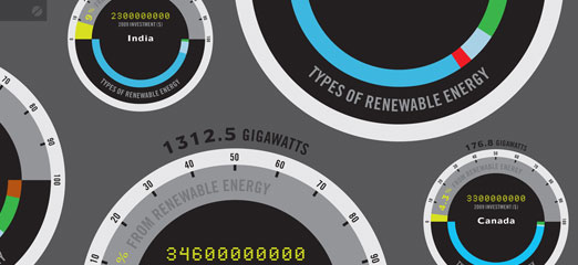
Running On (Almost) Empty

Let’s face it — we’re going to run out of coal and oil sooner or later. This infographic was jointly created by GOOD and OPEN, and it looks at the countries “that are spending the most on renewable energy, along with how much of it they currently produce, and what percentage of their total energy output that represents.”
How Much Water Is Used In The Production of Different Foods? (Interactive)

This interactive infographic by Italian graphic designer Angela Morelli illustrates how the the vast majority of water we consume is hidden in the production of our food. Find out which types of food are the worst culprits, and what you can do to reduce your personal water usage.
How Energy Efficient Buildings Work

And finally, we have this snazzy little number by Spaceway. It explains how, where and why heat escapes from a building, as well as what to do to keep in. From elaborate materials used in multimillion pound buildings, to simple things like energy saving light bulbs.
Did you know?
You can access several energy saving products for free thanks to the governments CERT program, such as loft and cavity wall insulation. You can find out if you qualify and request a free, no-obligation home energy survey here.